Coconut
Designed by Conrad Zimney
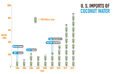
General Description: With this display I am trying to communicate to my audience that this section of the infographic is about the growth in popularity of coconut water over time in the United States. By showing the increase in US import of coconut I can effectively show my users how popularity for coconut water has grown over time. I wish I had even more recent data but unfortunately I could find any more relevant sources without having to spend money on the data files.
Emulation Description: I have emulated my color model by using the same green, blue, brown and orange in the infographic. I have also stayed on a white background as my color does. I have emulated my visual language model by maintaing a "flat" design, without adding any dimension to the display. I plan to further emulate my visual language model by using the same typeface and block image background themes.
First display that exploits the visual potential of numbers
Critique #1: Bryan Gula
Bryan generally thought I had use of color in my infographic, but thought that my arrangement of certain things could be done better. For example the diagonal text does not work well, instead using a tooltip-like circle would be better.
Model Emulation Feedback
Color model was emulated well, but Bryan wanted to see even more color on the graph. He thought that using more colors on the line would better highlight the company launches overtime.
Revisions based on this critique
Based off of Bryan's comments and critiques I decided to stick with teh bar graph, and change the text to be horizontal. I did not think his ideas on the new color decisions would improve the quality of my graph so I decided not to execute those.
First Iteration
Final display:
Second Iteration
Sources: The data/inspiration for this display came from the following sources.: http://www.datamyne.com/blog/imports/sales-swell-for-coconut-water/
Critique #2: Bobby Brooks
Overall Bobby thought that my line graph was confusing, he wanted to think of sales data when he saw the company launches however the graph is about import data. Overall prefers the bar graph because of the easy association with the years.
Model Emulation Feedback
Color model was emulated well, visual lanugage model could use the typography and boxes for labels.
Revisions based on this critique
Based off of Bobby's critiques I decided to add boxes around my title and labels on the graph. This helped me more closely emulate my color model as well as provide clearly context for the labels on the graph.
Critique #3: Theo Chin
Theo liked my graph overall but had some good comments as well, such as: Are the tick marks really necessary on the y-axis? Horizontal text would be better, and overall good use of color model.
Model Emulation Feedback
Emulated color model well, but should there be a background color? Hard to decide because of color model versus visual language model. Use typography and visual layout of visual language model more clearly next time. Overall prefers the bar graph as well.
Revisions based on this critique
Based off of Theo's feedback and critiques I decided to shorten the length of the y-axis tickmarks. I also made the text on the graph horizontal and more closely emulated my visual language model by using boxes around my text.
Critique #3: Michael
Overall Michael really enjoyed my graph. He thought that I channeled my color model as well as my visual language model very well. The labels were clear in aiding his contextualization of the bars.
Model Emulation Feedback
Michael's feedback was arguably the best that I received yet for this model. He suggested that I change the bars on the graph to be icons of coconut water to represent 10K metric tons of import. This would more clearly emulate my visual language model and aid in viewers understanding.
Revisions based on this critique
Michael's feedback was essential for the improvement of my graph. He gave me the idea of using coconut water bottles instead of green lines on my graph to represent the metric tons of US import of coconut water.
Critique #2: Sanjay
Sanjay liked my graph overall, he thought I did a good job emualting my color model and visual language model overall. He htought the message of this graph was very clear.
Model Emulation Feedback
Any reason why the bars are so thin? Could make the bars thicker for clearer representation. Again, wondering if the white background is the way to go. White background is my color model, but having a color could make the graph pop more and be more comprehendable.
Revisions based on this critique
Sanjay also prompted me to use a darker color for the background in order to make the graph more comprehendable.
Critique #1: Bobby Brooks
Bobby liked my revision overally. He liked that I took all of his critiques into consideration, specificially making the text horizontal and captializing the axes.
Model Emulation Feedback
Bobby thought that I continued to do a strong job emulating my color model, and additionally could much more clearly see the emulation of my visual language model in this revision. If anything he thinks that I should try a new background color in order to make other aspects of the graph pop.
Revisions based on this critique
Bobby prompted me to use a new color for the background. I decided to go with a dark background in order to make the white coconut water bottles pop more.


version 1
version 2
First Iteration
revision 2

revision 1
Second Iteration

Critique #3: Andrew Joung
Andrew was extremely enthusiastic about my chart, he loved my use of color and thought that they contrasted perfectly against each other and allowed him to view the differences in bars very well. He also thought that the y-axis and x-axis were very clear and it was very easy to tell what data was being visualized as well as my overall point.
Model Emulation Feedback
Andrew thought that my color model was emulated very well, and that my visual language model was clearly shown through my chart. He also really liked my label for the coconut and thought that I could include even more.
Revisions based on this critique
Andrew's comments allowed me to change the label on the coconut oil data row. I realized that the first version of it was not completely clear, and his feedback heped me write a new one. Andrew also prompted me to sort my data by one fat, so I decided to sort by saturated fat to place coconut oil at the top of the list.
Critique #2: Jacob Leighty
Overall Jacob liked my chart! His main suggestion was that I cut out some of the oils in the data so that there are less to compare total, and it is easier to get my main point across. He also liked my blurb/label for the coconut oil and though that having even more would be good and helpful.
Model Emulation Feedback
Thought that I should switch to a white background to better emulate my color model, but I emulated my visual lanugage model very well. Other suggestion was to play around with the layout to better match the visual language model.
Revisions based on this critique
This critique from Jacob prompted me to cut out some of the oils from the data as well since they are not all completely necessary to include.
Critique #1: Randi
Randi thought that I had a strong revision overall, specifically she liked my encodings in the bar chart, and thought that the label pointing out my topic was clear and well-done. She also thought that I could try overlapping the bars so that they don't "look like they add up to 100%" since not all of the percentages do add up correctly. She also thought that I could include less oils total since they are not all necessary to convey my point.
Model Emulation Feedback
She thought that I emulated my color model well, but that I should try a white background since it aligns with my color model, even though I recieved feedback telling me otherwise. More important to stick to my color model than adhere to that feedback in this context. Visual Language Model was also emulated well.
Revisions based on this critique
Randi's critique prompted me to change my background to the white so that it would match my color model. I also decided to use less oils total from her comment.
Critique #3: Theo
First version: Theo thought this version was too spread out, hard to know what hte bars are representing. X-axis is too far away, why so many ois? Choose the most important ones to prove a point. Second version: much better, definitely preferred. Theo thought that I should also change the bars to be one continuous bar that represents 100% of the total fat for each oil. That would make it the best for comparing coconut oil to other oils, which is the intent of the chart.
Model Emulation Feedback
Color model: Why is the background not white? Good emulation besides that, should try it in next version. Visual language model is ok, could be emulated more powerfully. Overall good job!
Revisions based on this critique
This critique also prompted me to push the bars together in order to create a "100%" bar for each oil. I also made the legend larger and clearer because of Theo's critique.
Critique #2: Gabe
First version: Ok, could be better. Matches color model well, more separation between oils would help, not as tall would be better to make it easier to read the x-axis at the bottom. Right now it is too far away and hard to see, the color mixtures are also confusing. Second version: cut "oil" from y-axis labels since it is redundant. Hard to tell which label is associated with which bar, use lines?
Model Emulation Feedback
Color model is emulated well, as well as typography. The visual language model would be better though. Gabe liked that I did not include "100%" on x-axis since it is not necessary.
Revisions based on this critique
I considered dropping "oil" from the y-axis, but decided not to because I thought that it did not look as clear without the label. I may consider removing for the final iteration however for now I am sticking with it. I squeezed the bars together in this iteration so that viewers would not have to scan across the whole page to recieve all relevant information.
Critique #1: Bobby Brooks
Overall good feedback, first version not so good, second version very strong. First version had too much varying color and hard to discern any real information from it. Second version was very clear and to the point. Easy to compare other oils to coconut oil. Are all of the data points (oils) really necessary? Could eliminate some in order to make text bigger and therefore more legibile.
Model Emulation Feedback
Color model emulated well, typography model emulated well, visual language model could be emulated better. No instance of bar charts so it's harder to emualte specifically, but still could use more representation.
Revisions based on this critique
Based off of this critique I made the text bigger, and more clearly labeled the coconut oil bar. This will allow viewers to more clearly distinguish the different fat compositions of coconut compared to other oils as well as more clearly read the label itself.
First Iteration
Sources: The data/inspiration for this display came from the following sources:
General Description: With this chart I am trying to convey to my audience the different nutritional composition of different oils. Here, viewers can clearly see the differences in percentages of 3 fats, monounsaturated, polyunsaturated, and saturated fats. Viewers can easily compare the difference compositions of other oils to that of coconuts. Some other sort of contextualization still needs to happen in order to show how even though coconut have high saturate fat percentage, they are healthier than most other fats on this table.
Emulation Description: Here I have emulated my color model by using the same colors as my color model does. I have emulated my visual lanugage model by maintaining a flat layout and am using text sparingly. I further emulate my text model by using the same typography as my text model does.
Final display:
Second display that exploits the visual potential of numbers
revision 1
Second Iteration

revision 2


version 1
version 2
First Iteration
